
Keratoptik
Conversion-driven e-commerce UX for high-ticket wellness products
Keratoptik is a specialized optical and eye-care clinic offering professional vision health services.
Role & Context
- Role: UX/UI Designer · Web Developer · Digital Strategy
- Platform: Shopify
- Industry: Healthcare · Optical services
- Market: Montreal (QC)
- Year: 2024
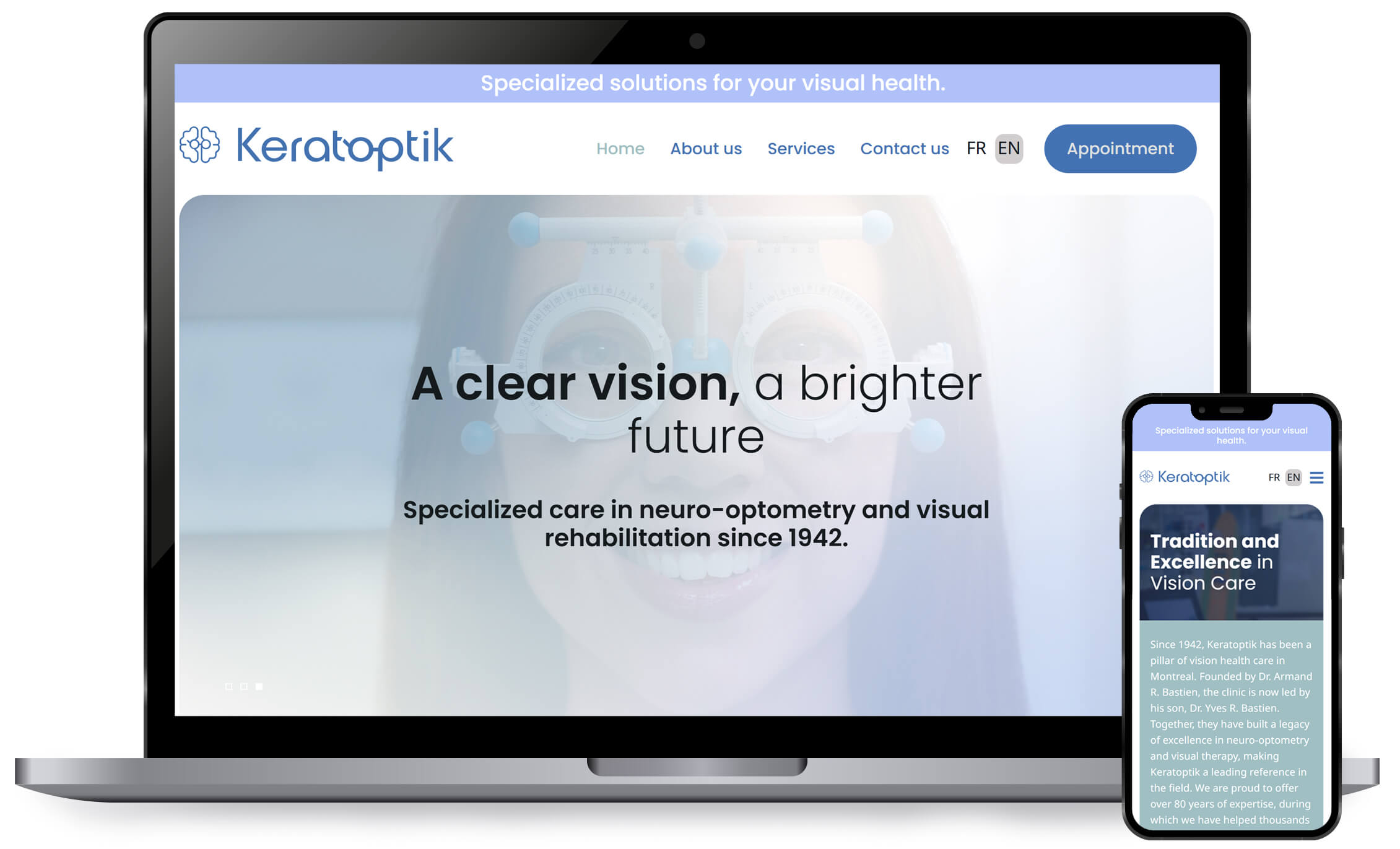
Project Overview
Before the redesign, the website did not clearly communicate the clinic’s services or level of expertise and was not adapted to the needs of its primary users. The experience lacked clarity, accessibility, and the level of trust expected in a healthcare context.
The project involved a full website redesign, focused on creating a clear, reassuring, and accessible digital experience, with particular attention to users with visual impairments, who represent a significant portion of the clinic’s audience.
The site was designed to be easy to navigate, readable, and inclusive, while maintaining a professional and trustworthy tone aligned with healthcare standards.
The Challenge
Business Challenges
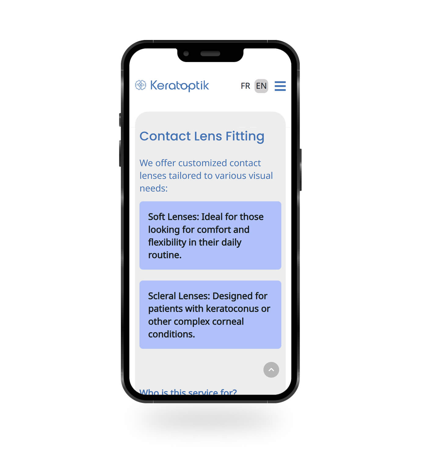
- Clearly communicate specialized optical and eye-care services
- Build trust with new and returning patients
- Reflect professional expertise and medical credibility
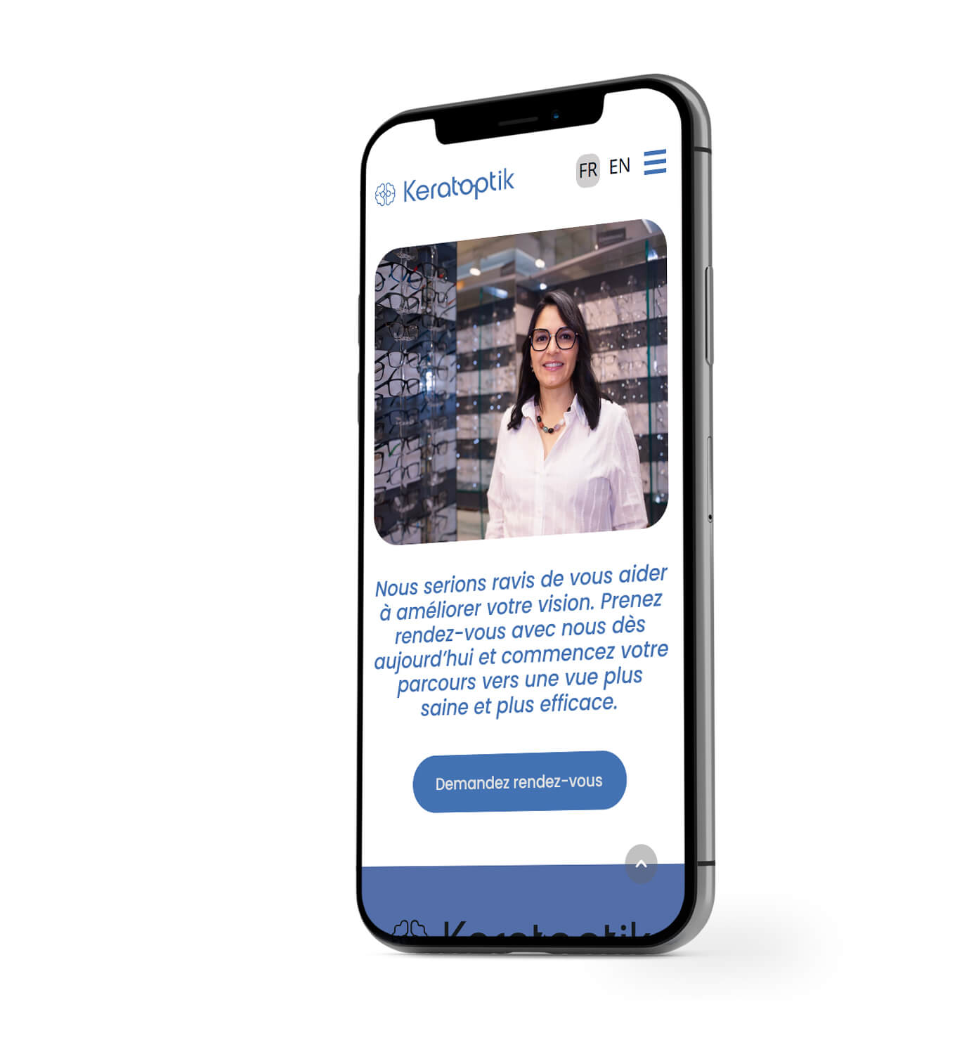
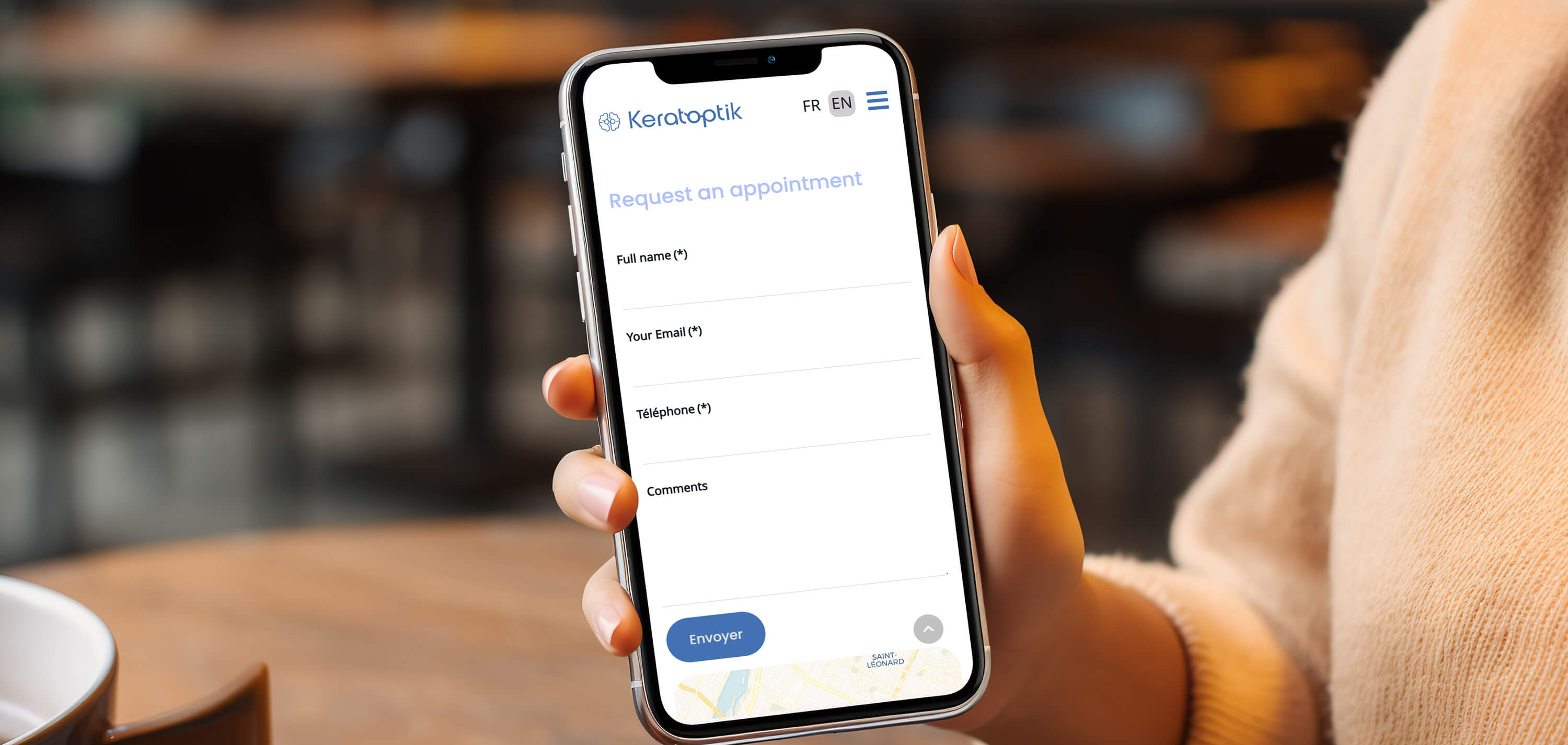
- Encourage appointment inquiries in a respectful, non-aggressive way
UX Challenges
- Designing for users with visual difficulties
- Ensuring high readability and strong contrast
- Simplifying technical or medical information
- Reducing cognitive load for users seeking care
- Creating a calm, reassuring experience
My Role
I led the redesign end-to-end, focusing on accessibility, trust, and patient-centered UX.
My responsibilities included:
- UX research and content restructuring
- UX/UI redesign for desktop and mobile
- Accessibility-focused design decisions
- Information architecture for healthcare services
- Joomla front-end customization
- Bilingual content structure (EN / FR)
I worked closely with stakeholders to ensure the experience aligned with both ethical healthcare standards and real user needs.
Strategy & Approach
Accessibility-first UX
Because many users experience visual difficulties, accessibility was a core design driver rather than an afterthought.
- Increased font sizes and clear typography
- High-contrast color combinations
- Clear spacing and layout hierarchy
- Simple navigation with predictable patterns
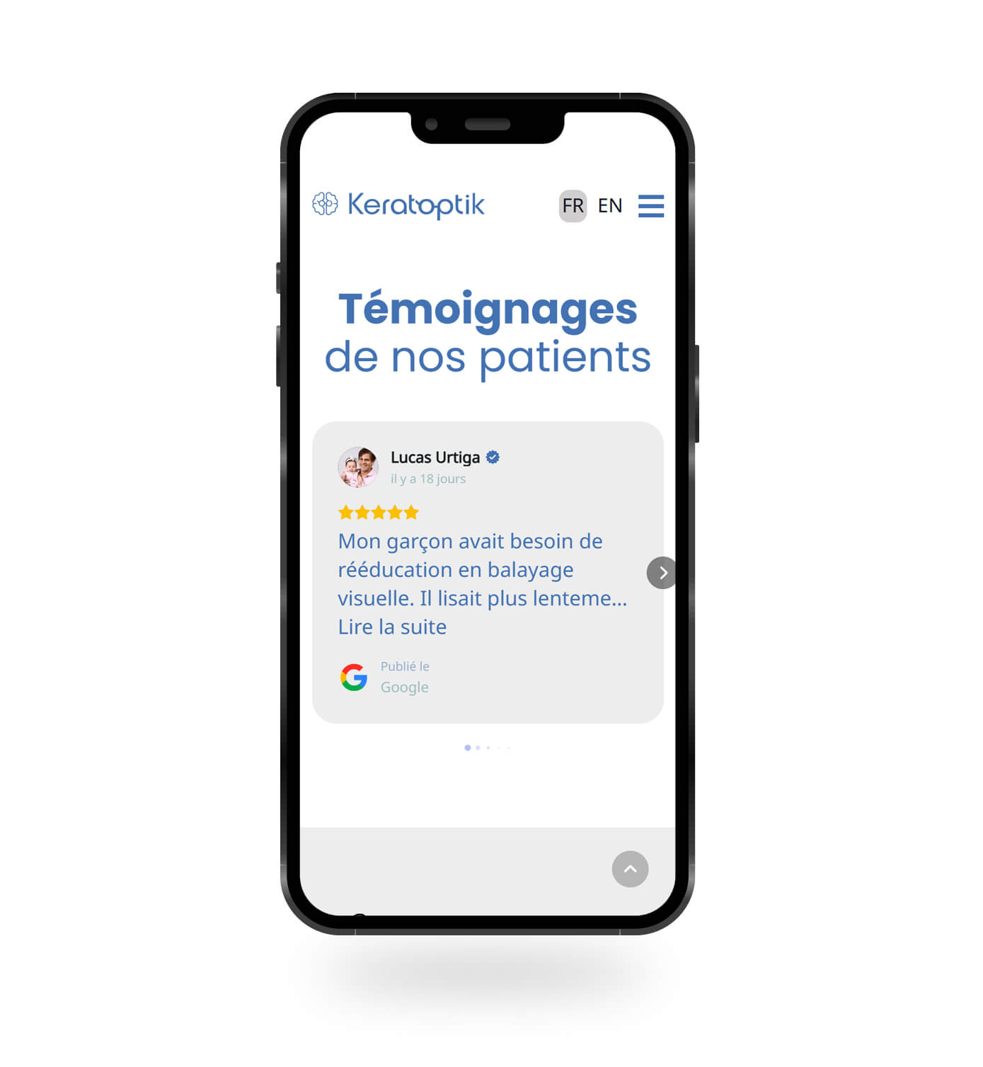
Designing for trust and reassurance
Healthcare UX must reduce anxiety.
- Calm visual language
- Clear service explanations
- Avoidance of aggressive marketing tactics
- Focus on clarity over decoration
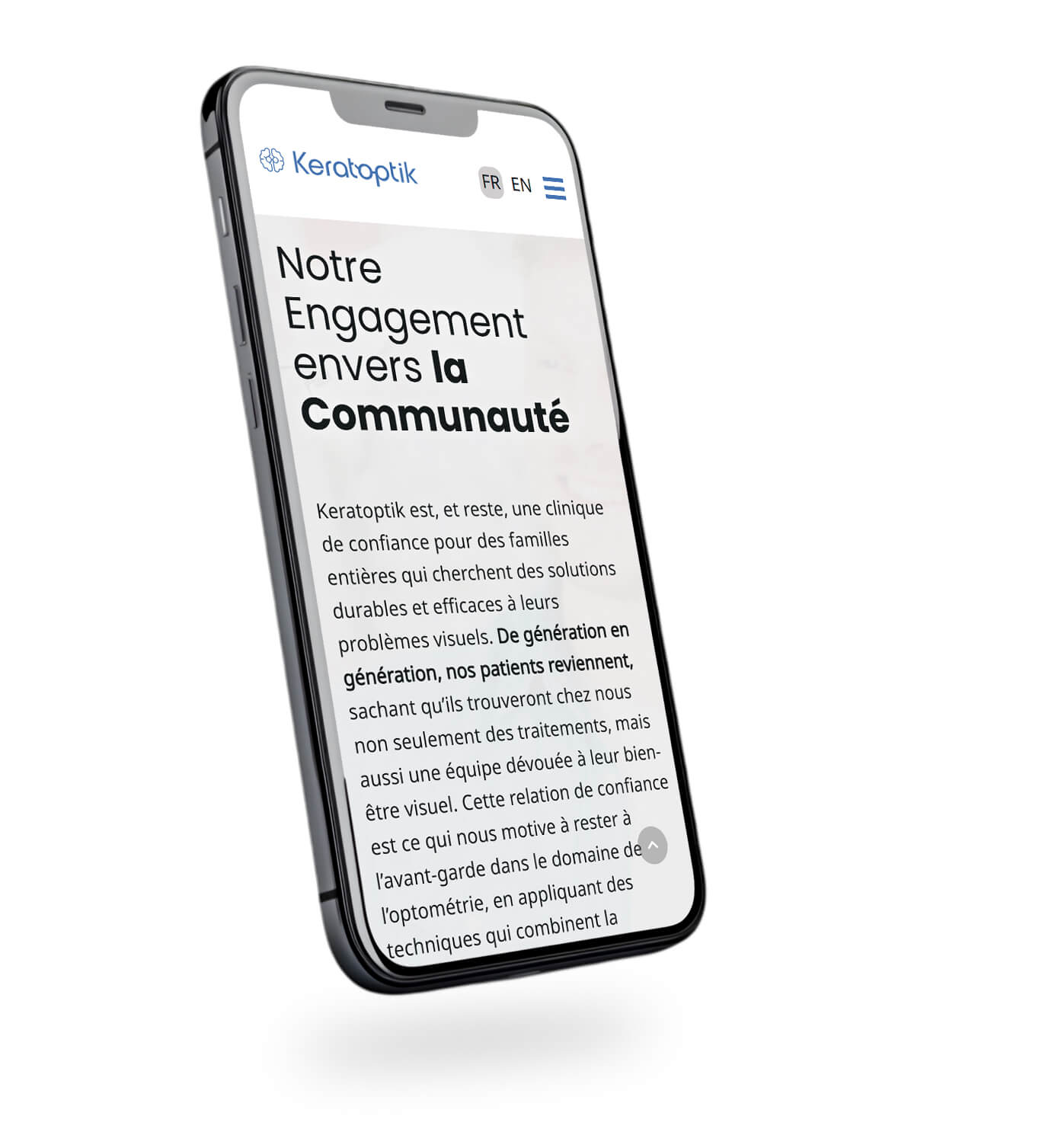
Bilingual and inclusive experience
Content was adapted — not simply translated — to ensure:
- Clear, natural English
- Accessible Quebec French
- Consistent terminology across both languages
Design & Development Decisions
- Joomla-based modular layout
- Typography optimized for readability
- Clear content hierarchy and spacing
- Reusable service layouts
- Responsive and device-agnostic design
Results & Impact
While the project continues to evolve, the redesign resulted in:
- Improved clarity across product pages
- Stronger premium brand positioning
- Easier comparison between collections
- Reduced friction across the buying journey
- A scalable foundation for long-term growth
Reflection
This project reinforced several key principles:
- Luxury UX is driven by clarity, not visual excess
- High-ticket purchases require education before persuasion
- Strong information architecture benefits both users and developers
- Business context should always guide design decisions